This article was originally posted on my blog here. This is the fifth in a series of game design articles about Puzzledorf. You can see the full series here.
This article discusses the visual design of Puzzledorf, looking at the visual style but also how the graphics tie in to game design to enhance the users experience, including subjects such as how the visuals are used to communicate ideas with and engage the player and help teach through design.
Searching For a Style
I want to start with a background on how I conceptualized the visual style and the process behind it. Before we dive in, some quick images of the final look.


The visual look of Puzzledorf was quite fluid in the beginning. Back when I was studying 2D animation, we watched videos from an interesting series called “The Animator’s Survival Kit“. It’s absolutely fantastic and worth getting a hold of for anyone serious about animating. The man who produced it is in fact the animator who designed Roger Rabbit. There’s a very interesting story in there about how he designs the visuals of a cartoon.

He begins with reference images. He would have a board somewhere and stick up lots of photos of various characters or reference images for whatever he was working on. In Roger Rabbits case, he stuck up lots of different cartoon characters from other works. He spent weeks if not months doing this without drawing anything. Then one day someone asked him to draw a particular character. He went to the board, started drawing, and out came a fully formed concept for a character, on the spot.
He’d taken these designs and reference images deep into his subconscious, it had become part of his natural way of thinking, and so when someone asked him to create a character, his brain served them back up again to help create something original. This is how Roger Rabbit was born.

It is important then for an artist or animator, when looking to design something visual, to use reference images to help design something unique but also worthwhile. This is what the greats did, and it helps produce amazing work. The important thing to remember, however, is to use it as inspiration, not to simply copy. Be inspired, then create something that is your own.
I do this a lot in my games, especially when working with a new type of visual style I’m not familiar with. Before Puzzledorf, a lot of what I did was graphics for side-scrollers, so top-down was not something I was comfortable with. It takes a different approach. Designing palm trees for the beach level, for instance, required looking at inspiration from various area’s, from photos of real life palm trees, to other retro games like Sonic CD.

Here’s a quick glimpse at some of my inspirations for the character and early working designs. I tried to find characters from a number of different visual styles and see which I preferred. The next step is to do background tests, testing them against various backdrops to see which ultimately fits. You can try them against other people’s backgrounds as a rough guide, and then the next step is to create concepts for your own background. The light blue characters were all early working concepts, one was unfinished.

And here are some examples from an entirely different art direction the game could have taken.


In the end, despite being more detailed, it felt like it lacked the sort of life I wanted this game to have. There were probably 3 big inspirations for me in the back of my mind for Puzzledorf, when it came to the visual style of other games:
-
Early Sonic games
-
Gameboy Zelda, Pokemon and other top-down Gameboy games
-
Retro arcade games with their bright, flashy styles
The bright and flashy retro games in particular is something I’m in love with, and I loved the idea of catching some of that energy, and distilling it into a Puzzle game that popped visually but had a relaxed vibe. The above concepts did not do that for me. It was also hard because, as I said earlier, I was not used to working with top-down graphics.
I had earlier worked on a previous mobile puzzle game, and I began to modify the graphics of that original.

This was closer, but not quite there. It was a little too busy, too much of the visuals felt like they were fighting for attention without a clear focus for the viewer. I wanted something with a softer touch, with a clearer focus on where the player should be looking, and a sense of adventure. I also wanted to create different worlds so the player felt like they were progressing through the game.
Because I wanted to create a sense of adventure, I started to experiment with some outdoor settings rather than a cave.

I felt like I was getting closer to what I wanted, but the style was still too busy. It wasn’t clear where the player should be looking – everything in the frame felt like it wanted to be the focus.
I began to realise the problem was that, for an adventure game like Zelda, this style would have been appropriate because you have a lot of open spaces. But for a puzzle game, the only area you want the player to walk is the central puzzle – everything else around it is just decoration. Which also means you want the players attention solely focused on the puzzle.
At this point I was also starting to consider PC rather than mobile, and this style was too compact for PC. I then progressed to a larger style for PC, focused on HD.

It didn’t look too bad when I left it with open spaces, but….

As I tried to add in more elements to frame the puzzle, it became too busy again.
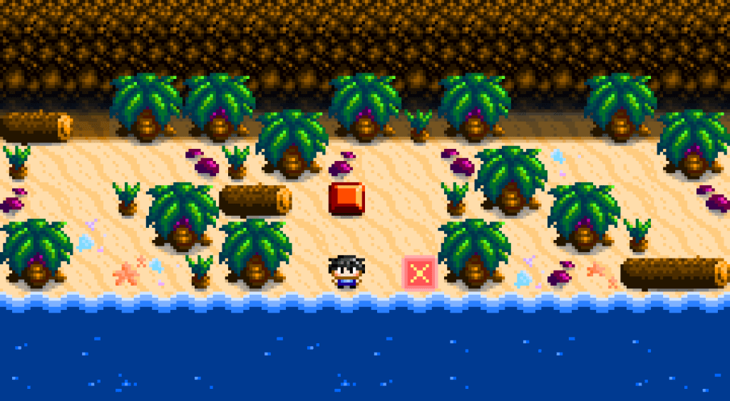
I then decided to try an island concept. I wanted to see that, if I reduced the number of visual elements in the image, did it help the player to focus on the puzzle in the middle of the screen?

I felt it did help the player focus on the puzzle, but the other visuals still felt like they were fighting for your attention. The island look also felt too empty for me, I wasn’t drawn in. There was nothing to anchor it as part of a larger world. I wondered about taking the island concept back into a cave.
At some point between going from mobile designs to the PC concept, I started using other people’s colour palettes. It really transformed my graphics. Not all colours work together, and using a limited palette of colours that someone has worked out all go well together turned out to be a real blessing. Below is an example of one of the colour palettes that inspired me by Davit Masia (but not the one I’m using).


I am obsessed with colour, and choosing the right colours is hard. I think that is why some of my earlier concepts lacked the pop factor. The below concept, while not final, was starting to get a lot more of that colourful, popping arcade feel I was looking for.

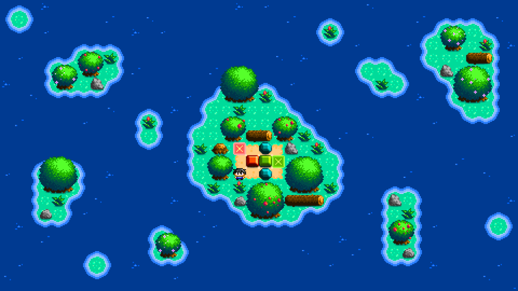
Much better, but there was still too much to look at, too many things felt like they were fighting for your attention. Ultimately I used just one island and that helped draw the players attention to the puzzle. Below is a colour test I did while getting close to the final product.

You can see the puzzle in the centre, but all of that empty space around the puzzle, the extra sand and decorations, visually makes your brain think it’s just as important to look at, even though it’s not. It keeps your eyes from being focused on what’s important, the puzzle. And adding more trees only made it worse.
I decided to go with, “Less is more”. A complete and utter reduction of all visual elements except what was absolutely necessary.

I worked out the area necessary for the puzzle. Then I added only as much tree / rock and extra visual decoration around the puzzle as was absolutely necessary to create a frame around the puzzle, to let the player know where they could walk or not. And I added the occasional extra tree so it didn’t feel too man-made / repetitive.
The result is not only is it more attractive, but the puzzle is absolutely clear. The player can easily see where they can walk and what the different elements of the puzzle are. This helps make the puzzle easier to understand, and I think that visual clarity is part of what makes it more visually attractive.
Finally, I wanted to somehow create visual softness. The game was supposed to be relaxing with a moody, chilled vibe, and the previous concept was a tad too in my face. The solution? Shadows.

I found that adding soft shadows transformed it from something that was good to something polished. Better still, it further brought the puzzle into focus by hiding the cave walls. I found the walls too visually distracting from the puzzle before, but the shadows softened them so that they could be seen without fighting the other visuals.
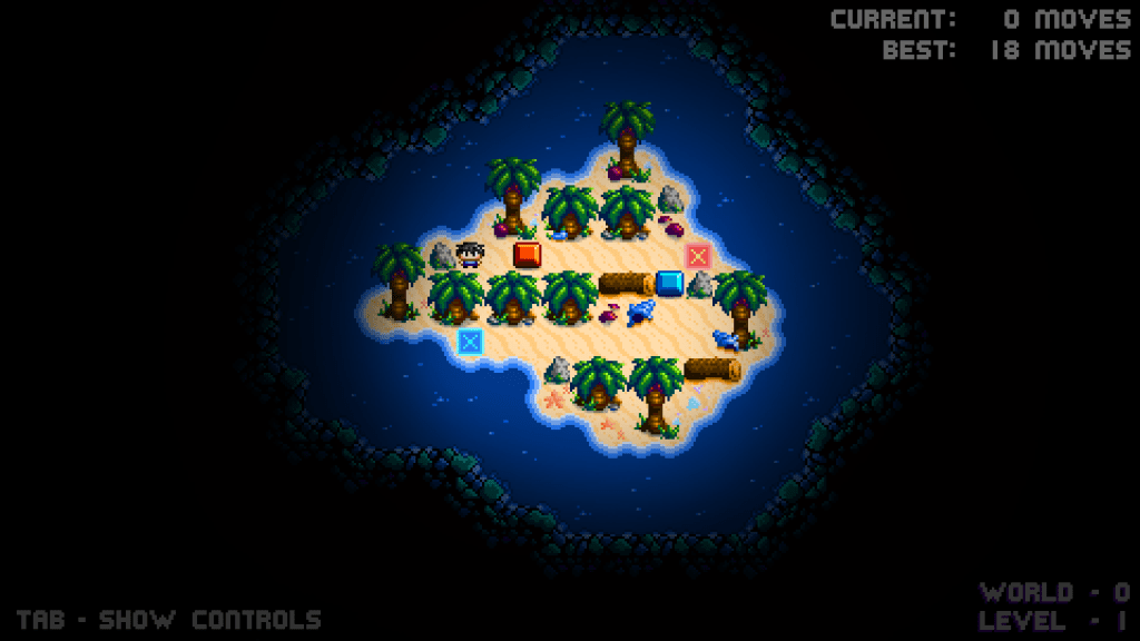
Here is the level in context with the UI.
And that’s how I came to my overall visual style for Puzzledorf. But now I want to talk in more depth about particular decisions and ways that I achieved certain things, such as communication with the player through the visuals.
Using Graphics To Describe The Puzzle
Let’s t