Hey there, this is Scott from SIGONO, the studio behind OPUS: Echo of Starsong. Today I’d like to share some of the lessons and pitfalls we ran into when we were designing our characters. Hopefully some of you out there will find this helpful, or entertaining at least!
[This post was co-written with our art team]
For some context, we’re an indie studio that focuses on narrative puzzle adventures with visual novel-esque storytelling. Our latest title, OPUS: Echo of Starsong, is a space opera heavily inspired by East Asian mythology.
With that out of the way, let’s get into what we’re here for:
How we created characters from scratch and integrated them into our game
Follow these simple steps, and you’ll get results like this!
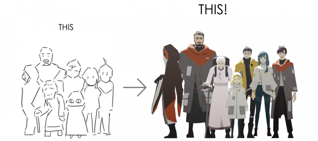
It's super easy (for you, we hope!)
So, the first thing we need to do is…
Start with the story!
To kick-start the whole process, we first go to our writer, who highlights the personalities and traits of each character as we go through a basic draft of the story. Based on this info, we start coming up with directions for their appearance and features. At this stage, we’re mainly concerned with gathering reference. No pen on paper yet!
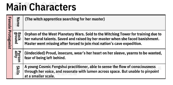
Early character document for the female protagonist, including her personality and goals.
Because the visual theme of this game is Asian sci-fi, we researched traditional and modern takes on Eastern clothing, sci-fi aesthetics, and cyberpunk.
Pinning down the silhouettes
Research has shown that human vision prioritizes shapes. So we started with silhouettes when we moved on to visualizing our characters. Using the references we gathered, the goal is to create shapes that capture an Asian tech aesthetic.
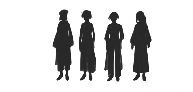
Some of the first silhouettes of Eda, our female protagonist. These all look pretty similar and didn’t leave much room for the imagination.
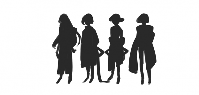
Second batch of silhouettes had more variation. This helped us decide which directions we could take them in.
Filling in the details
Once we have some good silhouettes to work with, we can move on to the outfits. Here, it’s important to stay focused on core requirements such as the Asian tech feel and the character traits. For example, one of our protagonists, Eda, is a space-faring adventurer who’s also the captain of her ship, so it’s important that she appears to be an independent and capable person.
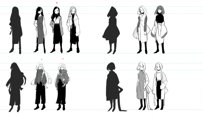
Director: We should go with long, black hair.
Artist: Is that your thing?
Director: …No.
Artist: …Righto.

We felt that the long hair better portrays her as someone who keeps their cards close to their chest. So we picked a few that’ll fit the hairstyle.
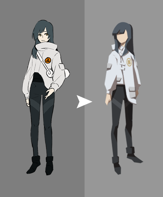
Here’s what we settled on at the time. We later toned down her Asian features after her backstory was tweaked, and removed the more flowy lines to further emphasize her independent and adventurous nature.
Bringing in the color
Now it’s time for the color palette. Although Eda is capable and self-reliant, she also hides a low self-esteem, and yearns to feel wanted. So we avoided bright colors, and tried palettes with low saturation.
Trying on different color combinations. At this stage, blue and purple seemed to better fit her personality.
Director: Wait, my spidey sense is tingling, can we stick her in an environment?
Artist: Righto.
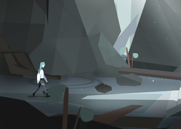
Taking the environments into consideration
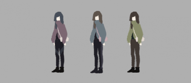
We placed Eda in some of our concept environments to get an idea of how she would look like in game, and immediately noticed that she became one with the background. It was clear that an entirely low saturated palette wasn’t ideal.

It's kinda hard to see her...
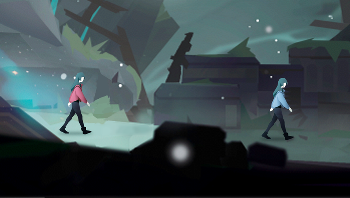
Using something more saturated will allow her to pop, but doesn't quite fit the character.
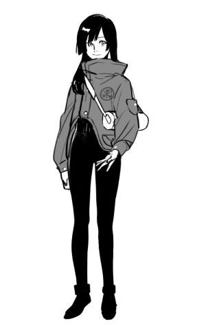
We ended up with a bright, but greyish blue palette for Eda.
The grey blue palette gives Eda an added air of rebellion and mystery. It also provides enough visibility for her in game.
There you have it. Once we have the main characters down, we can move on to other characters…
Creating cultural looks
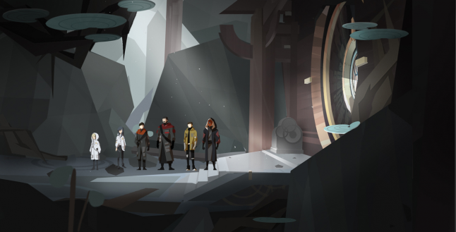
The main setting of the game, Thousand Peaks, is meant to be a big cultural melting pot where travelers from all corners of the galaxy cross paths. So to ensure that players can easily recognize where each character belongs, we need to establish a basic visual language for the main factions.
Thousand Peaks: Lots of pockets and patchwork, low color saturation, jagged outlines and more um, species.
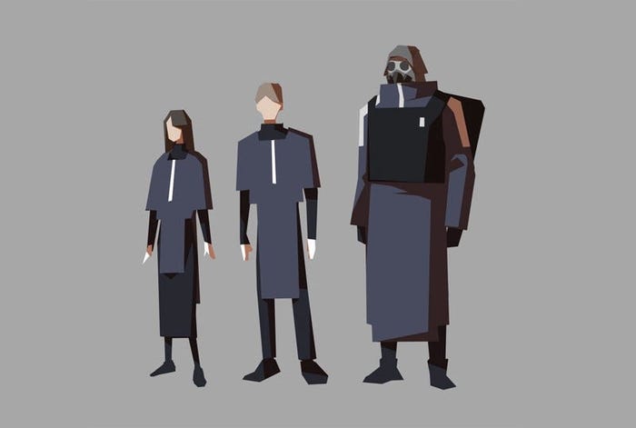
United Mining: Dark blue, square shapes, right angles, geometric contours.

East Ocean: Red, white, and black as basis. Prominent Asian style clothing and appearances.
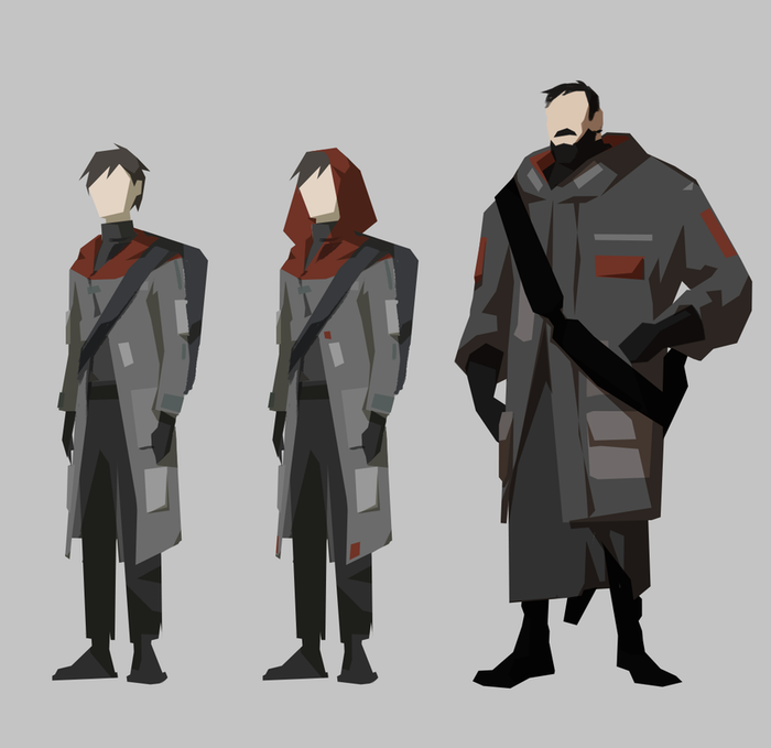
The male protagonist and his companion are exiles who escaped East Ocean, so we had to conceal the East Ocean elements a little, while maintaining the connection.
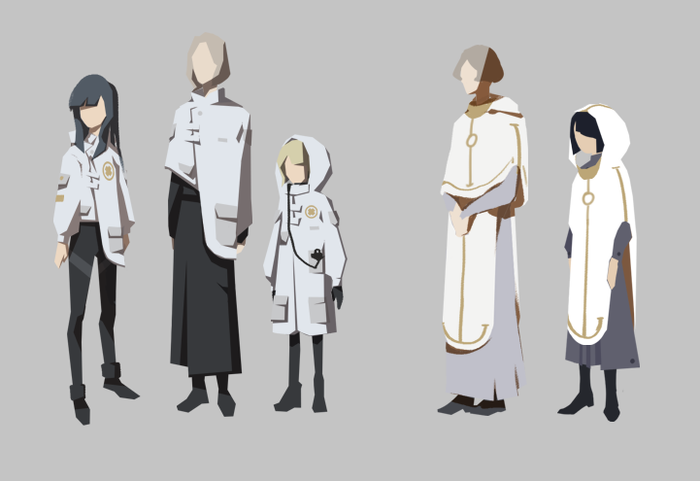
Uniforms for the spaceship Red Chamber, which were designed to resemble garments worn in the Witching Tower, but with some unorthodox designs to signal their defiance towards the Tower’s doctrine.
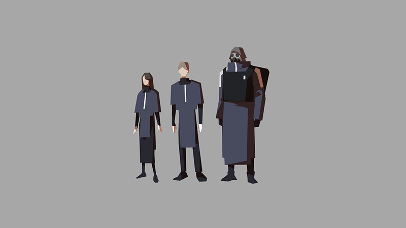
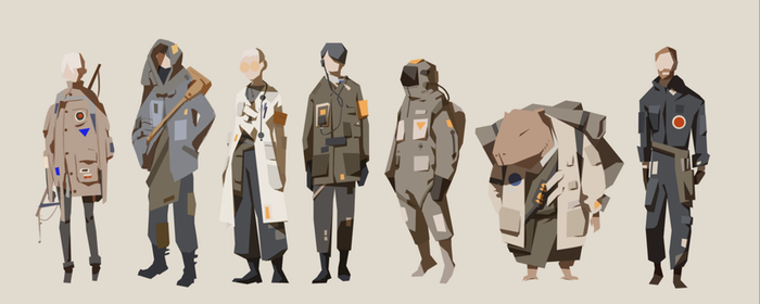
Ensure readability with height charts
After a few rounds of tests to establish the overall look of each character, we throw them into a height chart. This has a few advantages:
Provides a clear reference
Ensures they can easily be told apart.
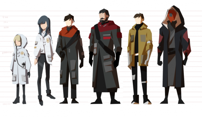
Height chart version 1