
In 1991, the gap between what was possible at home and what was possible in the still-relevant arcades was narrowing. Early arcade games often relied on abstract concepts and symbols to create compelling action: that triangle is an asteroid-shooting starship; that horizontal bar is an agile tennis player. The Sega Genesis found fast success with ports of more advanced arcade hits like Altered Beast.
But this next generation of machines would not be confined to mere mimicry; with the release of the Super Nintendo 25 years ago this month, games designed from the ground up for home consoles would change our expectations of what was possible and deliver on the promise of richer, more immersive experiences. We felt this most immediately in the striking visuals; over time, a number of distinct styles would emerge as aesthetics.
Compared to machines released during the Reagan era, the SNES was capable of an explosion of colors: 32,768 all told, 256 at once. A technique marketed as “Mode 7” allowed developers to enable a kind of pseudo-3D by rotating and scaling sprites.
Different materials could be approximated: this looks like molded clay, that looks like a child’s scrawled crayon. Later advancements made possible visuals built on Silicon Graphics workstations along with true polygonal graphics. Now you could build entire vehicles out of triangles and spin them around as full 3D objects.
Looking back, Super Nintendo games may look simplistic or rudimentary. But at the time, the SNES allowed artists to bring their visions to life, and players swooned to never-before-seen vistas. Many of those players grew up to develop games themselves, and the impact of the SNES is evident in their work.
We talked to many of today’s game creators about the aesthetics of the Super Nintendo, and how that machine helped shape a generation of play.
***
1) Pixel art paradise
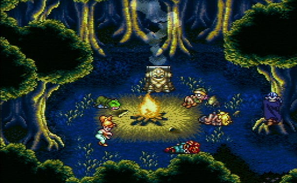
If today’s games strive for photorealism, then the Super Nintendo was the pinnacle of pixelated Pointillism. Just look at the image from Chrono Trigger [above]. Each pixel was a small dot of color that, when combined, formed something richer and greater than the sum of its parts--especially when viewed on the lower-resolution CRT televisions of yesteryear.
“In my opinion, the SNES was the golden age of pixel art. It had enough complexity to look interesting, but was limited enough that you had to be creative with it. There's a certain sweet spot for pixel art... too low-res and it's ugly, too high-res and it's not even pixel art. The SNES, to me, struck the perfect balance between those two extremes.” - Eric Barone, ConcernedApe (Stardew Valley)

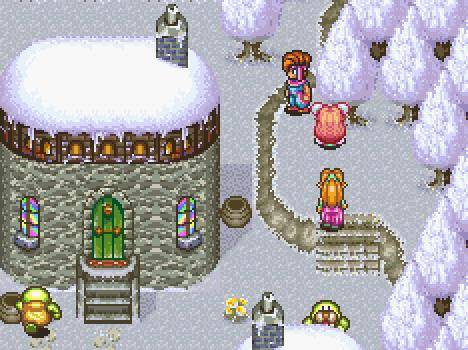
Harvest Moon
“It seems as though "Final Fantasy + pixel art" has become synonymous of the aesthetic identity of the SNES...any time an overhead game looks beautiful and has pixel art, people think about Final Fantasy, even if said game is nothing like Final Fantasy.” - T. J. Thomas, alpha six productions(Joylancer)
Secret of Mana
“In childhood, when I played pixel-art games, it wasn’t “pixel-art”, it was just “art”. I couldn’t imagine these screens would ever look more beautiful or detailed, because just like everyone else, I was interpolating the pixels as I watched. I was adding in detail that wasn’t there.” - Rex Crowle, ex-Media Molecule, FoamSword (LittleBigPlanet, Tearaway, Knights & Bikes)
2) “Mode 7”
<iframe title="Embedded content" src="https://gfycat.com/ifr/FatherlyBlaringFantail" height="360px" width="100%" data-testid="iframe" loading="lazy" scrolling="auto" data-gtm-yt-inspected-91172384_163="true" data-gtm-yt-inspected-91172384_165="true" data-gtm-yt-inspected-113="true"></iframe>What began as a simple trick to approximate three dimensional space in a 2D-based system became a visual hallmark of the SNES and a key differentiating factor in the fight against Sega. Some games used the sprite-rotation with subtle elegance (Final Fantasy III opening); others poured it on thick (NHL Stanley Cup).
“Seeing the Mode 7 effect for the first-time (and every time afterwards) was incredible. It was just so digital and futuristic. When the Mode7 kicked in and screens started scaling and zooming, it was like the console was transcending reality!” - Rex Crowle
<iframe title="Embedded content" src="https://gfycat.com/ifr/TalkativeMisguidedIsabellineshrike" height="560px" width="100%" data-testid="iframe" loading="lazy" scrolling="auto" data-gtm-yt-inspected-91172384_163="true" data-gtm-yt-inspected-91172384_165="true" data-gtm-yt-inspected-113="true"></iframe>
ActRaiser
“SNES games would rotate and scale anything and everything, without regard for how blocky and pixelated stuff got. We didn't know to care back then. It was just amazing to behold.” - Tom Happ, (Axiom Verge)
<iframe title="Embedded content" src="https://gfycat.com/ifr/LimpIdealisticIcefish" height="482px" width="100%" data-testid="iframe" loading="lazy" scrolling="auto" data-gtm-yt-inspected-91172384_163="true" data-gtm-yt-inspected-91172384_165="true" data-gtm-yt-inspected-113="true"></iframe>“When you are escaping [in Super Metroid] and the level tilts to and fro, that was a use of the system’s graphics that I thought was really ingenious.” - Chris Johnston, Adult Swim Games (Headlander, Pocket Mortys)
<iframe title="Embedded content" src="https://gfycat.com/ifr/BlaringMelodicBalloonfish" height="480px" width="100%" data-testid="iframe" loading="lazy" scrolling="auto" data-gtm-yt-inspected-91172384_163="true" data-gtm-yt-inspected-91172384_165="true" data-gtm-yt-inspected-113="true"></iframe>“I still play the original F-Zero now... The exhilarating thrill of speed and brilliant use of Mode 7 was like nothing I’d ever played before. Later iterations of the game introduced true 3D, and yet they never quite managed to reproduce the pure and simple elegance of the original pseudo 3D. - Phil Tossell, Nyamyam, Ltd. (Tengami)
3) Chunky & Colorful
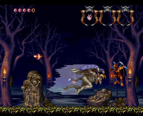
Demon's Crest
NES characters and worlds were often simple enough to be recognizable with few details: Think of Ninja Gaiden’s Ryu cascading over the same repeating platforms, or Contra’s soldiers ambling through a monochrome jungle. But the SNES boasted big, bold figures traipsing through detailed vistas bursting with color.
“The NES and prior generations still required some use of your imagination to really get a feel for locations, but I think SNES took it to the next level where it was all there spelled out for you. Everything from the dark and slimy tunnels of Super Metroid to the realistic locales of Street Fighter II were able to be beautifully rendered on the SNES with its wide color palette.” - James Petruzzi, Bit Kid Inc. (Chasm)
“There was something about the palette that was used in Super Mario World and the fluidity of it that stuck out. I just stood there for ages staring at it, saying ‘Dad, Dad. I must have this.’” - Rhodri Broadbent, Dakko Dakko (Floating Cloud God Saves the Pilgrims, Scram Kitty and his Buddy on Rails)
“I always felt like it had a chunky look to it. Possibly because it had a resolution of 256 x 224 while the Genesis was 320x224? Also, the hardware has this limitation where the palette is divided into 16 parts with 16 colors each, and each tile or sprite can only select one. So you'll see a lot of images where all the rocks, say, are shaded with a ramp from light to dark grey, then the plants are all shaded with another ramp from light to dark green. Things would thus be ‘contained’ in separate parts, often following collision boundaries, in a way that feels almost tactile. It nets a different look than in later consoles where any color could go anywhere.” - Tom Happ
4) Weirdness is its own reward
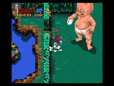
Zombies Ate My Neighbors
In the early 90s, game designers were still testing the boundaries of player expectation. There were no rules. Cue psychedelic boss fights, ravens rotating around the moon, and one giant baby.
“There's a certain ‘feel’ to the SNES that is kind of hard to describe, but that I've sought to capture in my own work. I guess it's a certain playfulness, or a feeling of being on the cusp of some great discovery, some great ocean of the imagination that you're only just dipping your little toe into.” - Eric Barone
<iframe title="Embedded content" src="https://gfycat.com/ifr/RegularPlainAracari" height="480px" width="100%" data-testid="iframe" loading="lazy" scrolling="auto" data-gtm-yt-inspected-91172384_163="true" data-gtm-yt-inspected-91172384_165="true" data-gtm-yt-inspected-113="true"></iframe>
Yoshi's Island
“With Yoshi’s Island, games really started to be stylistically more creative… we don’t have to stick with this linear progression into realism. We can be more out there in what we do.” - Rhodri Broadbent
<iframe title="Embedded content" src="https://gfycat.com/ifr/SimplisticHeftyFoxterrier" height="560px" width="100%" data-testid="iframe" loading="lazy" scrolling="auto" data-gtm-yt-inspected-91172384_163="true" data-gtm-yt-inspected-91172384_165="true" data-gtm-yt-inspected-113="true"></iframe>
Earthbound
“Earthbound uses a lot of interesting tricks... Especially at the end of the game. I think back in the day, people thought it looked like an NES game and didn’t buy it. They were right--it did look like an NES game, but it was an aesthetic choice.” - Chris Johnston
5) “Digitized” graphics
No tags.